Overview
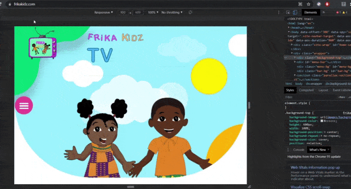
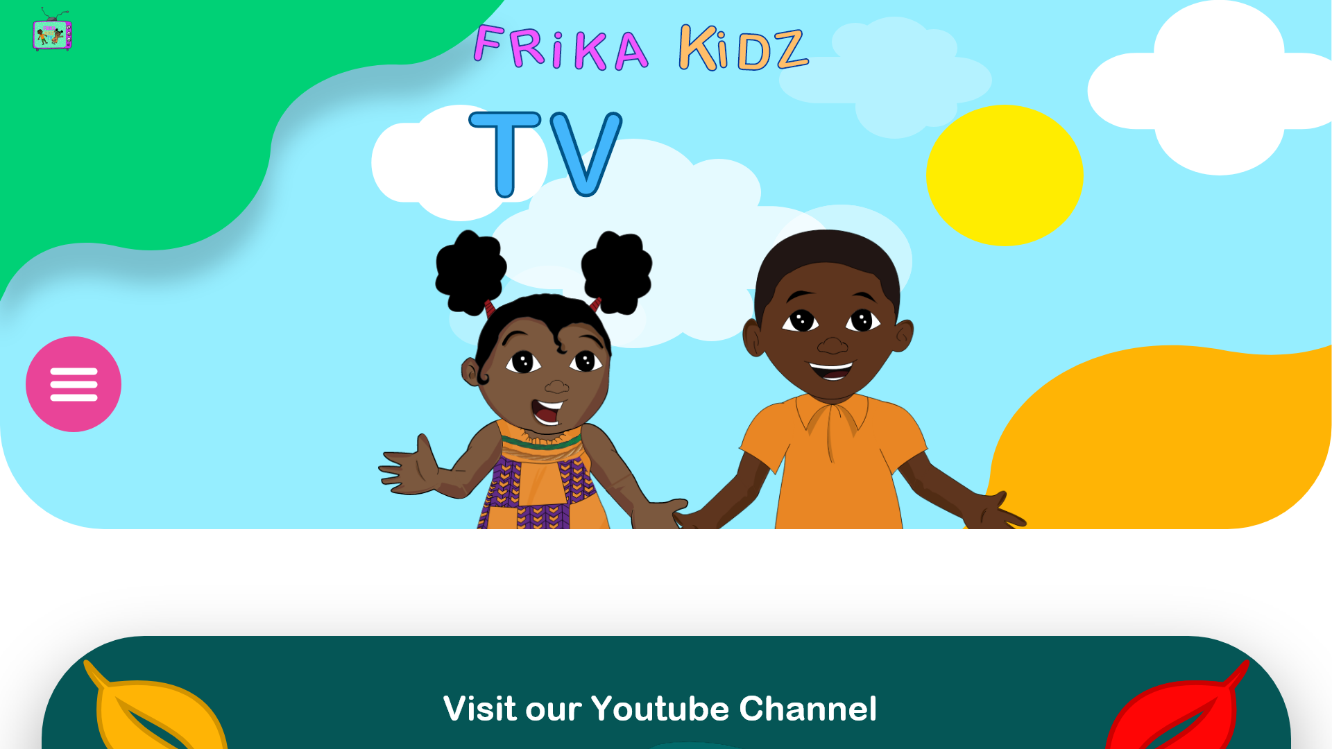
Frikakidz TV is an educational cartoon platform, with a playful approach that promotes African values and cultures.
Problem
Frikakidz Tv is a newly formed startup and have limited budget in comparison to their competitors on the same market. The challenge to build an educational platform on which children can learn about different African cultures.
Goal
Frikakidz Tv's aim is to bridge that gap and to develop large repertoire of stories , languages, alphabet and games coming from the old continent.
Their main goal is teach children different African cultures and folklores using playful activities.
01
Research and Analysis
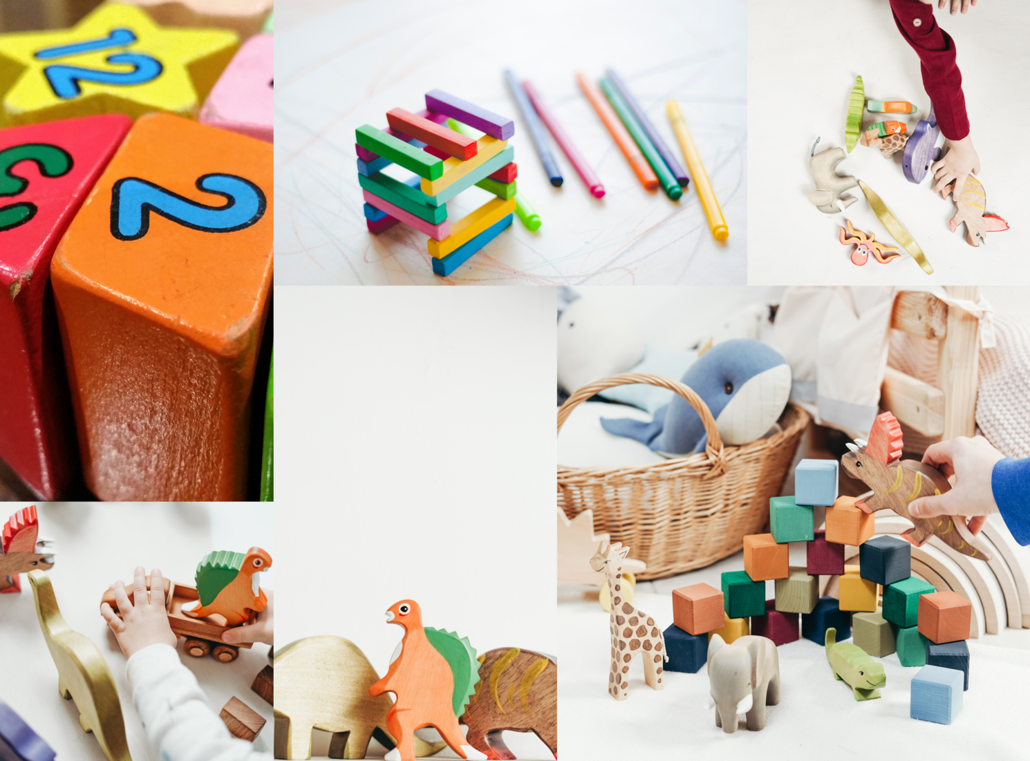
Learning with shapes
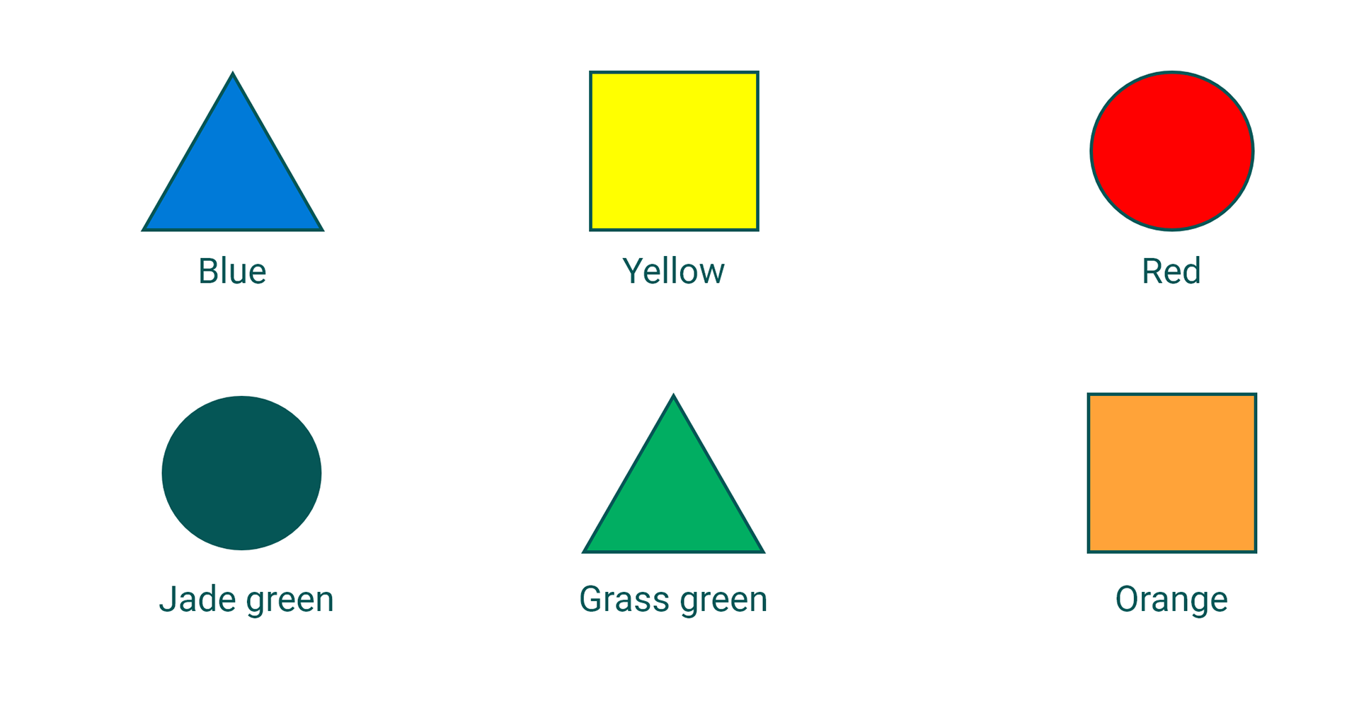
There is a strong emphasis on which colours should be displayed on the website because it is a key component to children's ability to comprehend things they interact with. Colours can either have a positive or negative reaction on a child's brain.
Warm colours have the tendency of being more stimulating while others have creates calmer reactions from children. Colours such as red, draws attention from viewers. Whereas colours such as green and blue triggers calmer reactions on children.
The impact of colours on Children
Children react to brighter colours because their eyes aren't fully developed yet .
Blue , Yellow and Red are the three basic colours children react the most to.
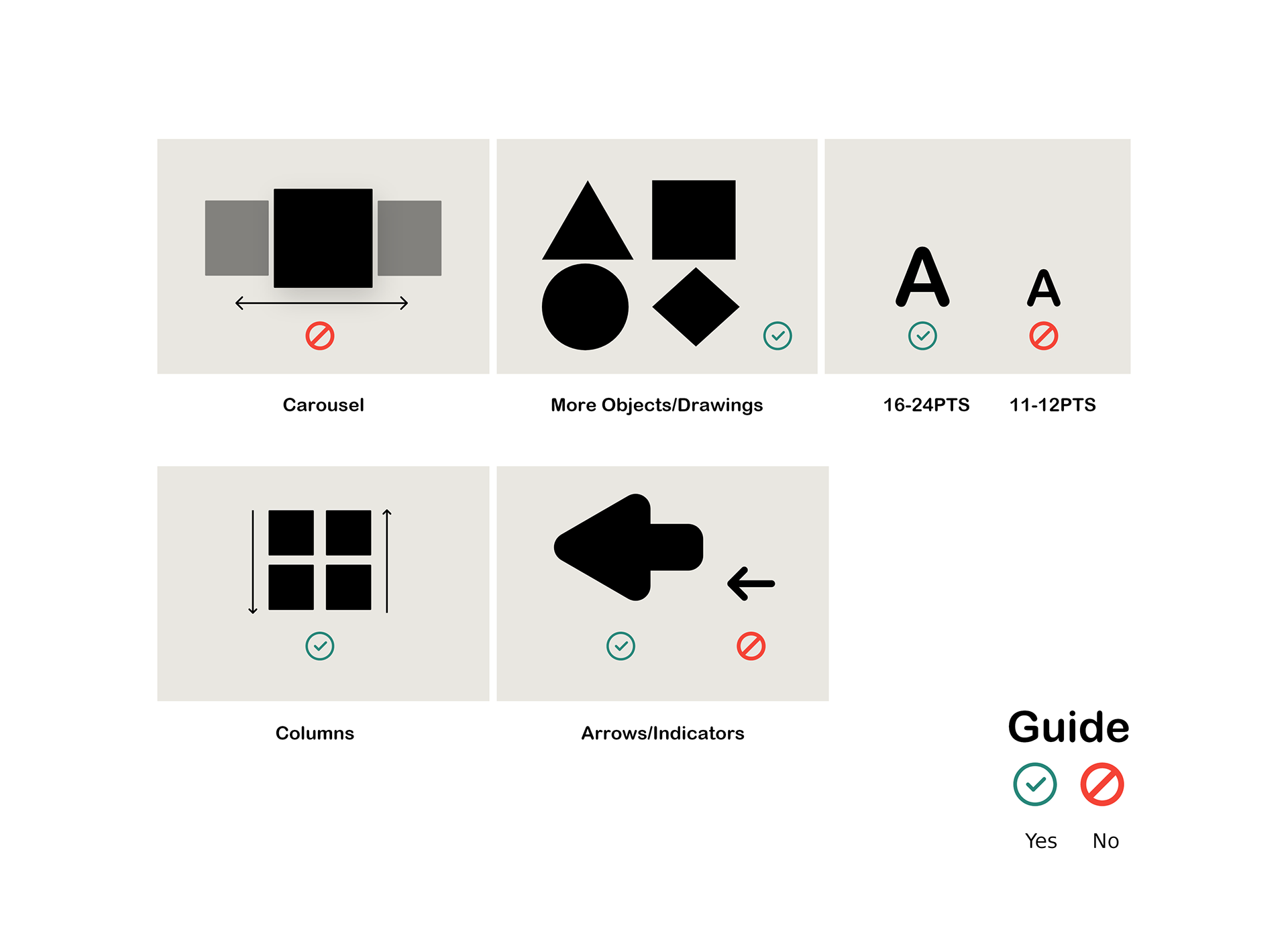
Guide to improve their visual learning.
My planning:
Avoid carousel sliders. Younger users need to be more in control during their navigation.
More objects, less writing. This will help their concentration and make them more aware.
Navigation from point A to B have to be as simple as possible as children may not be to find their activities easily.
A child's eyesight isn't fully developed yet , so large indicators / arrows are the main solution to allow them to perceive page indicators easily.
More objects, less writing. This will help their concentration and make them more aware.
Larger,bold font size . Around 16-24pts as oppose to the traditional 11-12pts.
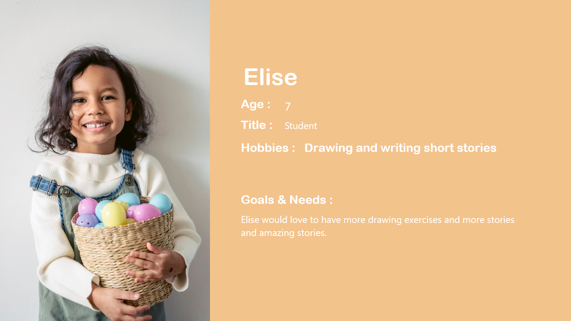
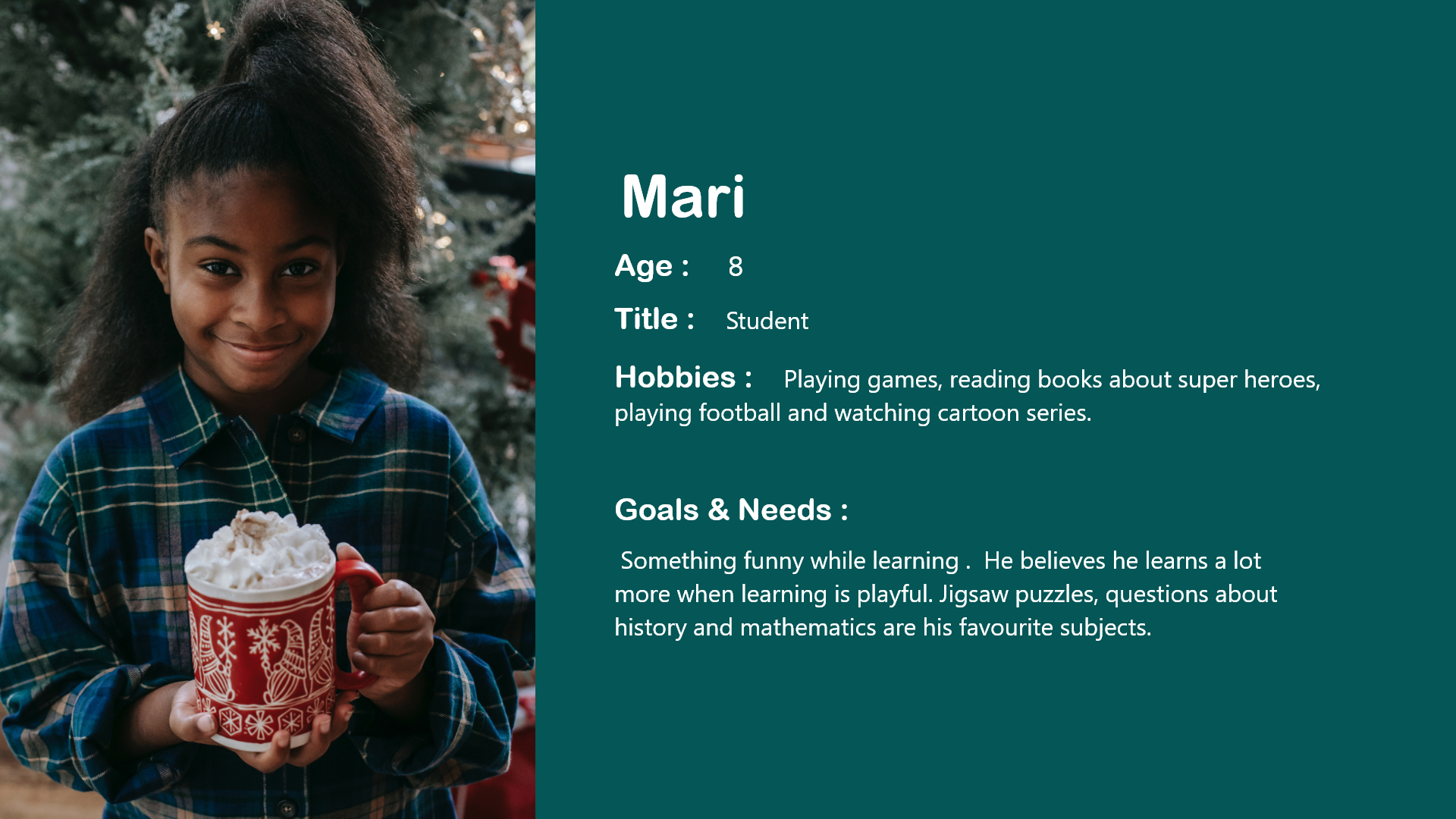
Personas
According to my researches , most of the children enjoy learning in a playful manner in order to keep being interested in particular subject on a long term basis. With the average age of 8 years old, most children by this have developed a certain level of curiosity which makes them ask many questions as to how things are made and why they are the way they are.
Here we focus on persona one because of her passion for history and the desire to learn more about different cultures.


User Journey
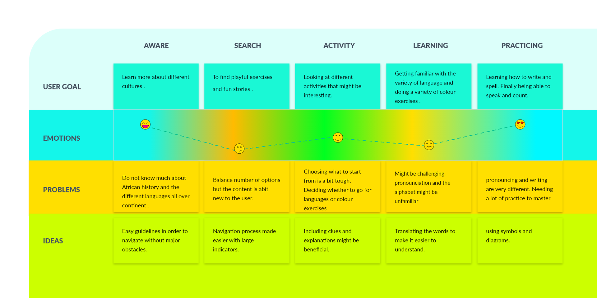
Analysis:
At first sight the user is taking the time to find their way into the website. In order to minimise the chances of being confused, the labels and menus have diagrams to make it easier for the user to find their way into the activities in hand.
Challenges:
Our user might not necessarily know which activity to start so we expect unpredictable events to happen.
Some of the language exercises might be challenging for the user as they might not be familiar with the prononciation or the alphabet in general.
Solution:
We have included direct translation and clues on how words should be pronounced.
Information Architecture and UserFlow

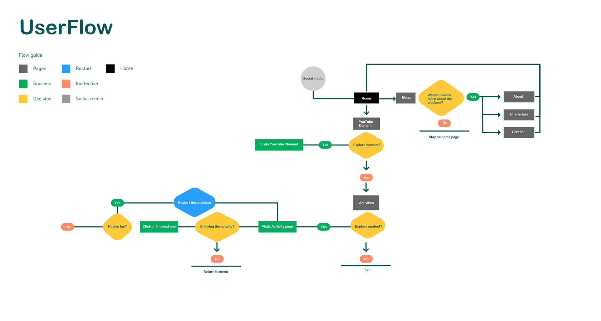

Sketches
The main purpose of brainstorming ideas through sketches was to have a claire voyance of the navigation process for the users.
An advantage of sketching out ideas is that I can discuss changes with the team and quickly iterate the presentation of the interface to the team. I made 6 different versions of these, with every version having pros and cons.
I have finally opted for this version simply because it looked simple, easier to build and also easier to find your way around the navigation.
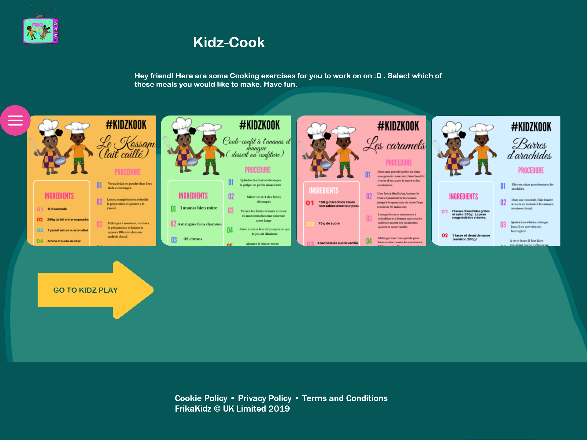
Low-fidelity design
Example
After doing sketches to illustrate the website interface, the next step was to do the low-fi , then testing the interface on different devices. It is useful to do this process because it allows us not only to see how the elements are placed and how they change from devices to devices but also gives us margin for error in case changes needed.


High Fidelity Design
After testing the navigation on multiple screens , I have then proceeded to the high fidelity design phase.
Things I had to consider:
keep the designs as simple as possible.
Colourful interface with less animations to ensure users are not confused.
Informations are as minimal as possible. More icons to describe the activities they chose from.
The website was principally designed for mobile /portable devices because of the high percentage nowadays. Therefore, overall we conducted approximately 25 tests on different devices and we ended had a few revisions to make in regards to the sizes of some of the elements on the pages.

Front-End Development
Language used : HTML - CSS - Javascript
The focal point in the development process was to ensure that the interface is easy on the eye and responsive on multiple devices.
Another thing to consider was the loading time. I had to minimise the number of animations and file size so that the navigation is fluid and uses less processing power. Slow loading time can frustrating for the user.
A lot of tests were made on different sets of devices and sent out to around 25 users in order to have accurate feedbacks from them, with most of them being positive feedbacks.
PS: Website has been changed since.