About ECDC
ECDC is an EU agency aimed at strengthening Europe's defences against infectious diseases and provide the general public with informations on how to prevent infectious diseases. Their activities within the european union includes : surveillance, epidemic intelligence, response, scientific advice, microbiology, preparedness, public health training, international relations, health communication, and the scientific journal Eurosurveillance.
The Challenge
ECDC is an information heavy platform which requires a lot of attention to detail -
The process of defining the navigation path is challenging because a lot of factors have to be taken into consideration:
- Which information are more useful ?
- How relevant are they ?
- Who are the users ?
- How relevant are they ?
- Who are the users ?
- How can they easily access to them?
- Is the navigation easy on the eye?
The Solution

A simplistic yet effective approach to allow users to easily navigate from point A to B -
- To build a better experience and navigation route for users. Narrowing the amount of information in order of relevance and importance.
- Ensuring users have easy access to informations by reducing the number of elements on display.
- Continuous navigation will allow users to always have an entrance and exit point.
- Consideration for colour blind users.
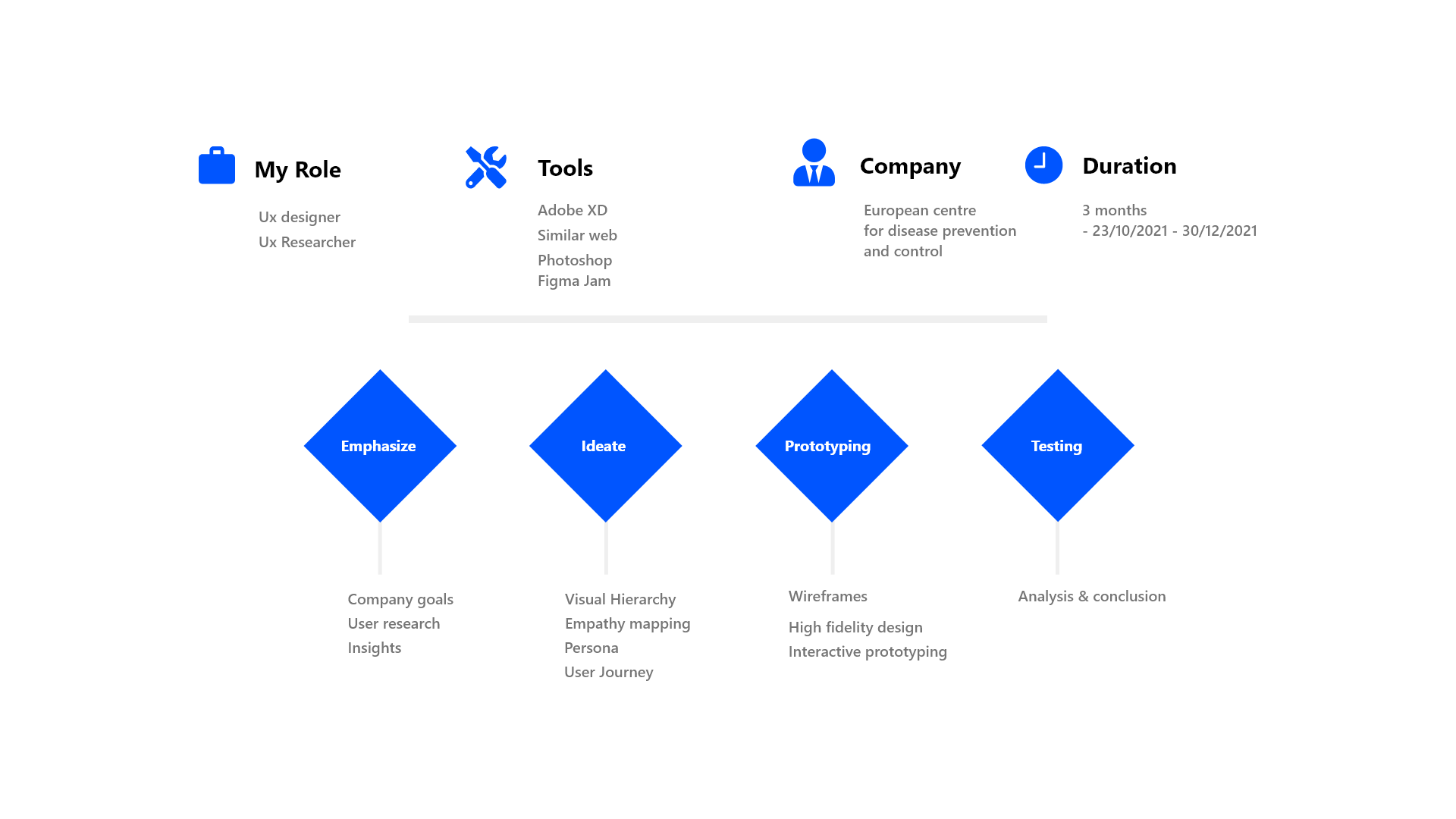
01
Research
“No research without action, no action without research”
- Kurt Lewin.
The very first step of my search was to understand who are the users, what are they looking for , how do they access information and how long they spend navigating on the site.
Quantitative research -
Users access informations on the website using various devices, with 49% coming from desktop devices, while 43% are coming from mobile devices and 9% from unknown devices.
Another key discovery was the age rate of the users. 40% of users are above 60+ years, meanwhile the second largest age group of visitors are between 45-60 with a percentage of 33%. 19% are between 25-40 and finally , 8% are under the age of 25.
Moving on to the keyword searches, Most users searched covid related topics at the period of time, with covid-19 being the trending topic due to the ongoing global pandemic.
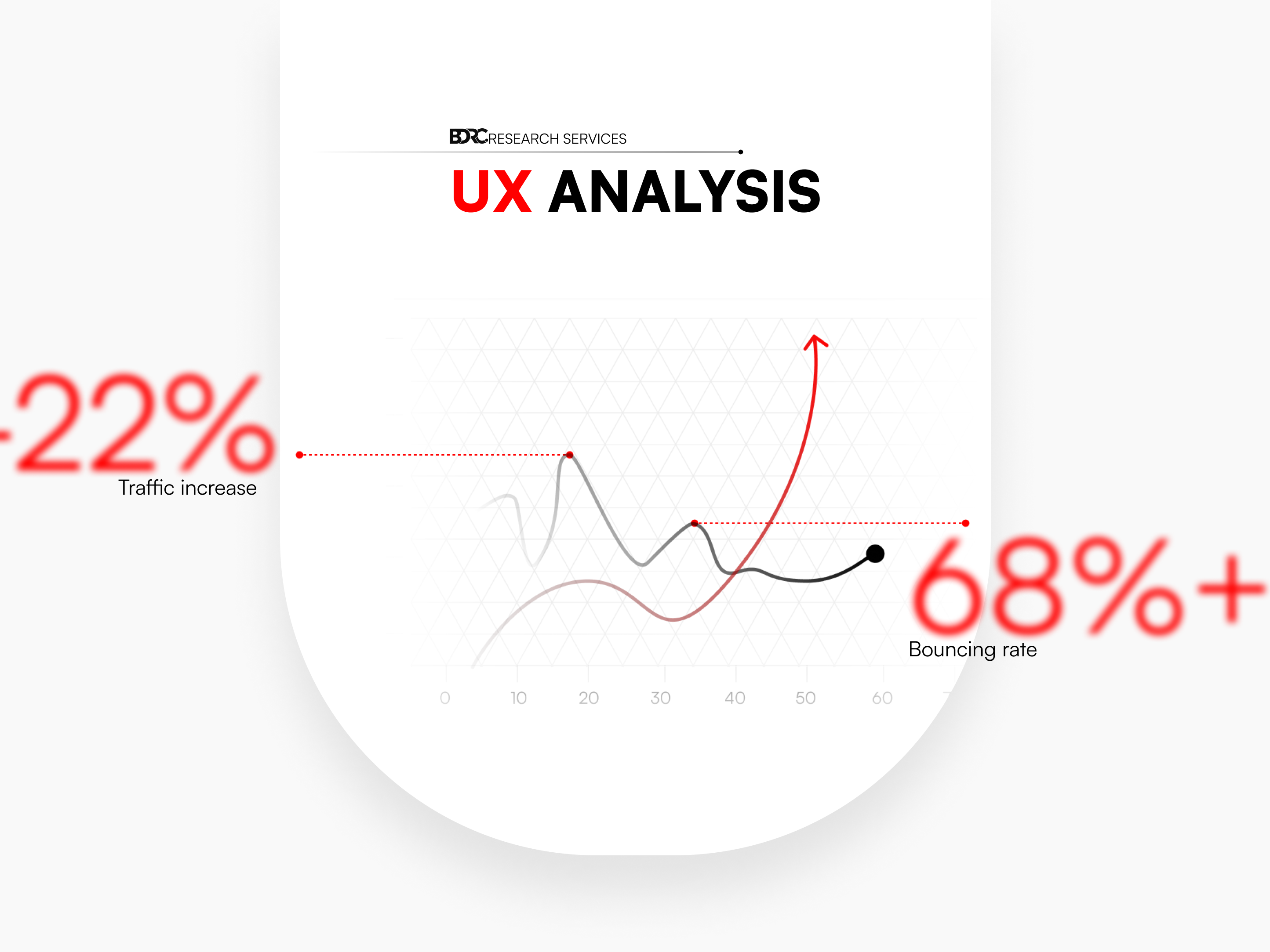
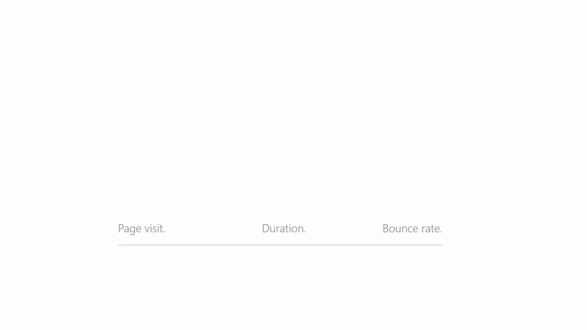
And finally , the engagement rate of the website regarding the users interaction and surfing behaviours. From the informations I have gathered, only 1.642 visits per hour and just under 1 minute stay per visit , with a very high bouncing rate of 63.89%.
It is important to note that the statistic on the age demographic of visitors is heavily influenced by, not only the trending health topic regarding the current ongoing pandemic but also, the direct relevance it has on them. Many of them are in the risk group of individuals who are vulnerable to COVID-19 or health professionals themselves. Therefore, accessibility is crucial in this case because a lot of them may find it challenging to find what they are looking for.
Insight
- The high bouncing rate is a direct result of content not being visually appealing to the audience.
- High desktop usage is due to the fact that most people of a certain are more comfortable searching informations using their desktop devices as opposed to using a mobile , which then is directly related to the fact that most of them are above the age of 60.
- A lot searches are covid related because most of the traffic generated are by users who are , either within the risk group, health professionals , relative that are at risk with health issues or how it affects their travelling schedules.
Solution -
1 - Create a visual hierarchy to ease the perception of elements on the website.
2 - Design different iteration to chose from.
3 - Prototyping and testing the results a few times to have consistent performance throughout.
02
Define
Implementing key elements and solutions to the navigation problems, Visual Hierarchy to user journey. These components helped me build a successful navigation path for users.
Visual Hierachy
Design and navigation guide:
The purpose of visual hierarchy is to arrange elements by order of importance , with the primary content, most relevant subject , topic or information being displayed in a distinctive way which helps users to perceive them before secondary contents i.e Colour contrast, picture sizes, positions, font types and sizes.

Font sizes

Figure 01 - letters are the same size and weight. The figure is not big enough to standout from the rest
Figure 02 - Different font sizes , with the header easily drawing attention and standout from the rest.
Strong Design hierarchy
Weak Design hierarchy
Strong design hierarchy is defined by the size and colour contrast, rendering it easier for users to perceive certain elements faster than others because they are larger or have distinctive colour contrast i.e. The main article is brighter than the others or has a strong colour contrast in comparison to the others.
Elements are align with each other , rendering it hard for users to visually separate some elements faster than others.
Content alignment
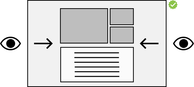

Figure 01 - Centered focus on the element. The elements are perfectly placed and aren't too wide, which makes it easier for the user to pay attention to the page content.
Figure 02 - Wide content draws the user's attention from side to side , which can strain their eyes and take time to read everything on the page.
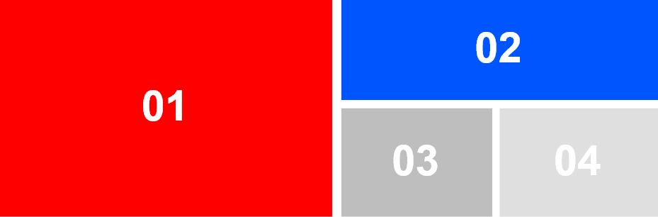
Colour contrast
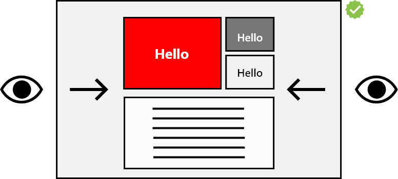
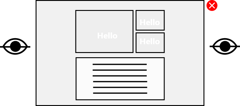
Figure 01 - The red colour Separates itself visual from the others because of it's colour contrast and bold Title, thus rendering it the prime subject the user identifies before hovering over other elements.
Figure 02 - Visual difficult to spot as the user cannot visually differentiate the main article to the other because of the negative colour contrasts.
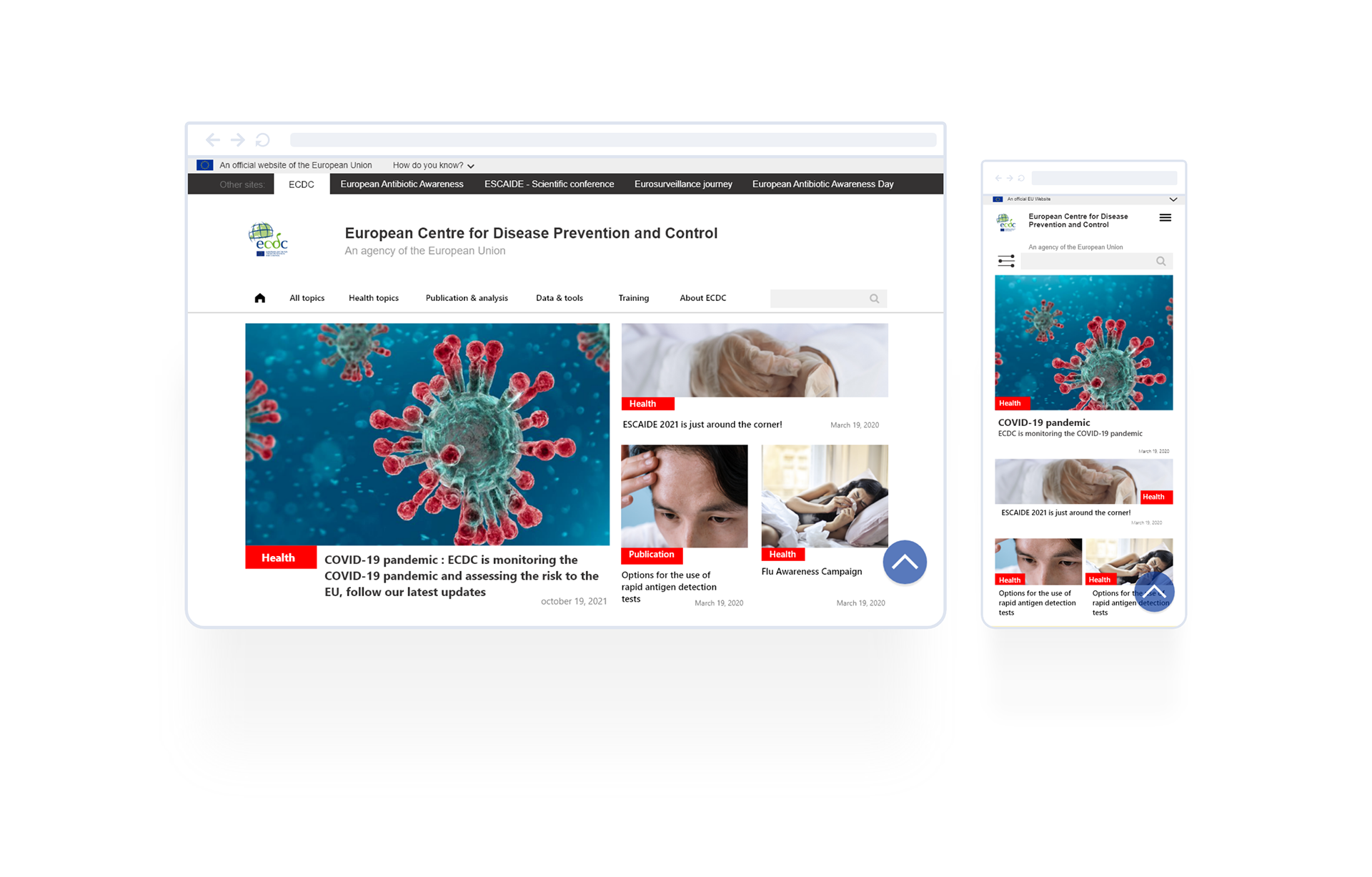
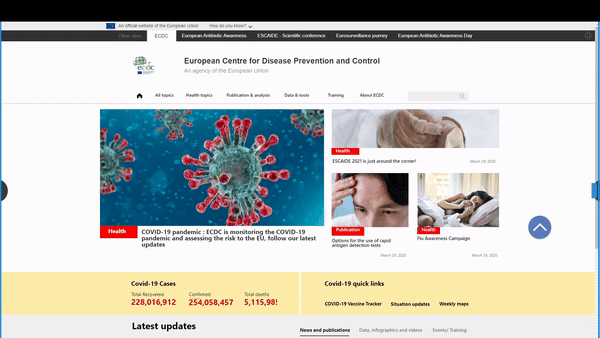
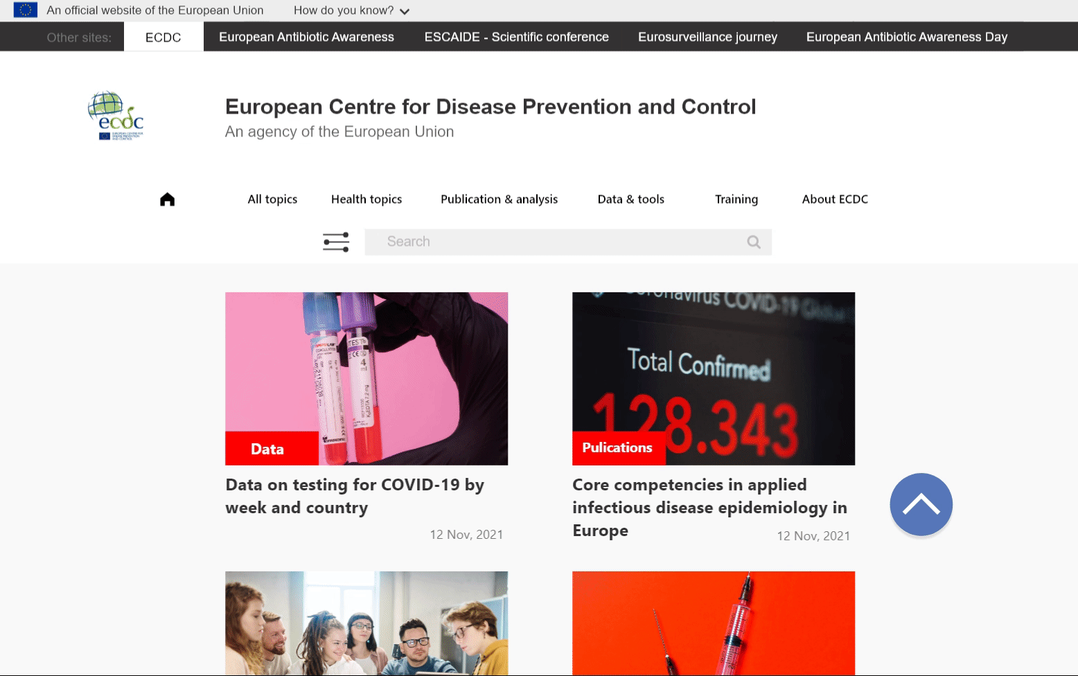
Continuous navigation : Search Page
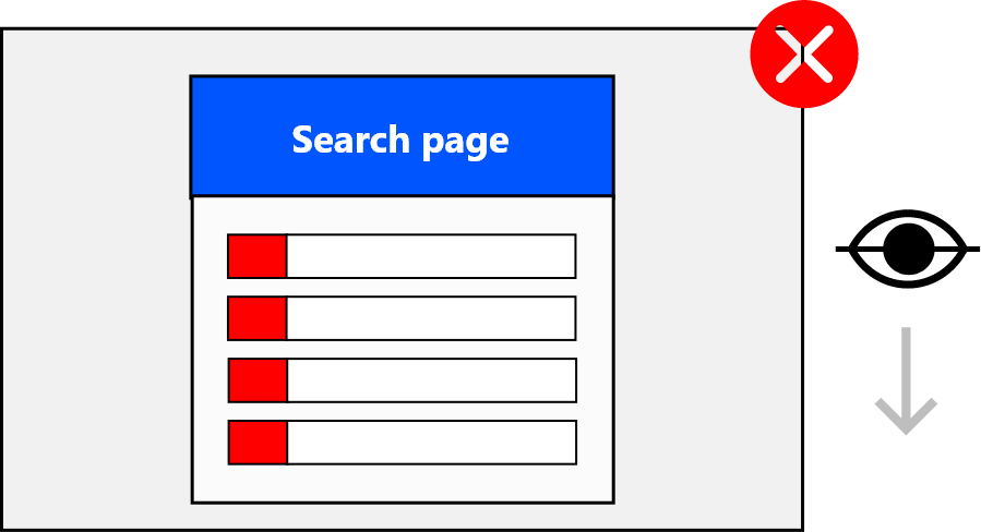
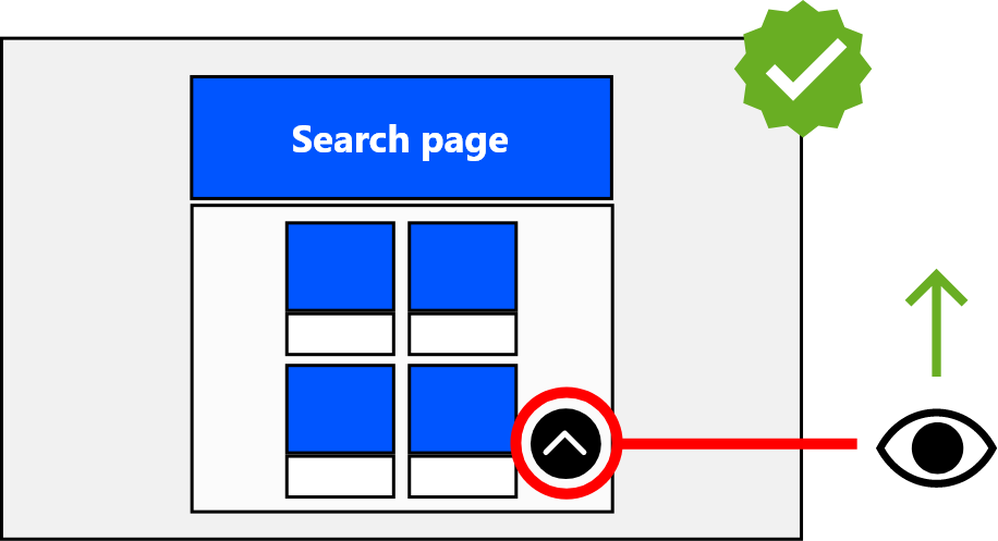
Figure 01 - The current state of the ECDC website doesn't have a back-to-top bottom. This makes the users take more time to get back to the top of the page.
Figure 02 - The inclusion of a back-to-top button helps users to experience a continuous navigation on the website, especially when pages are more than 3 screens long. It also helps them not having to go all the way to the top once they aren't able to find what they are looking for .
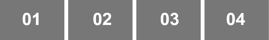
Labels
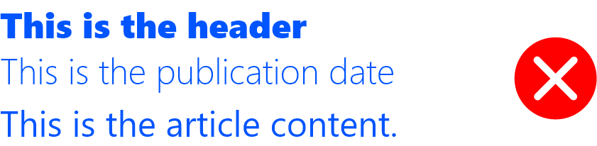
Figure 01 - Lack of size/font weight differentiation greatly disrupts a user's cognitive load. It takes more time to distinguish or visually separate the main title to the article content and /or label because they are almost the same sizes/font weights.
Case 01 - Separate the title from the rest by increasing it's font weight(Bold ), while the label should be semi bold and the description should be regular font weight. Each of them should have a different font size to force users to identify the most valuable information.
Filtering and refining search results : Search Page
The Problem

Problem 01 - One of the main issues with the search bar is the size of the container in comparison to the screen length, both on desktop/laptop and mobile versions. This is before the users have included or refined their searches.
Problem 02 - Whenever a user clicks on one of the option and apply the searches, the filter settings completely disappears from the navigation , leaving users with less options to help redefine the search results.
Problem 03 - Upon selecting an option, there is no indication of which option the users have selected. It tells you the amount of option selected but no specifically what was being selected.
The solution


This search filter works both on mobile and desktop, according to numerous tests conducted with colleagues. This helps them have more control and clarification of what exactly they are looking for.
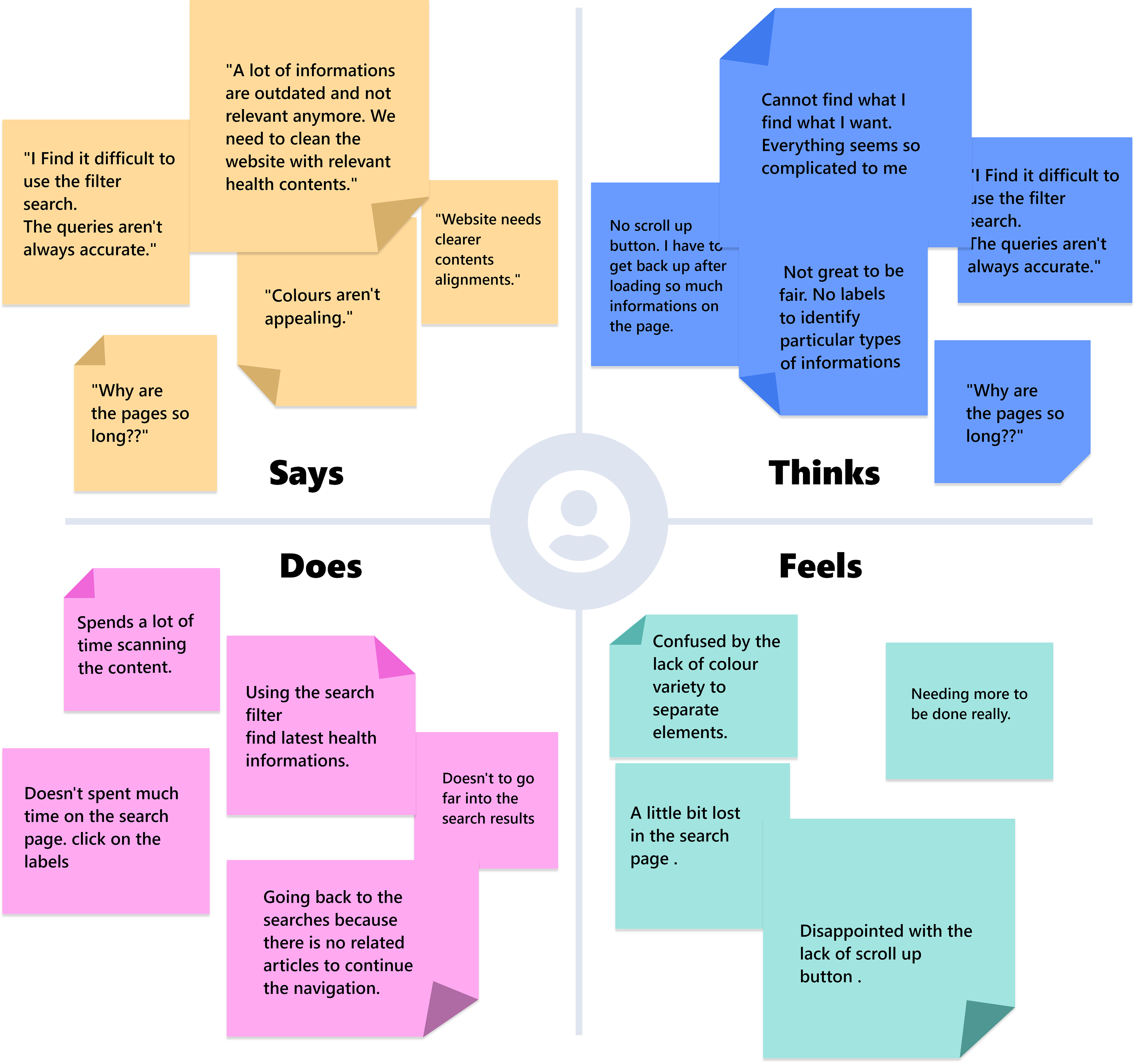
Empathy Mapping
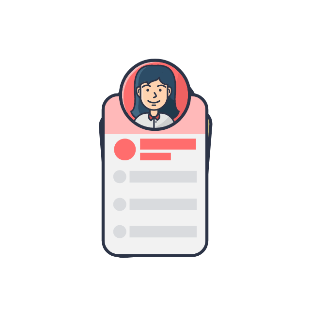
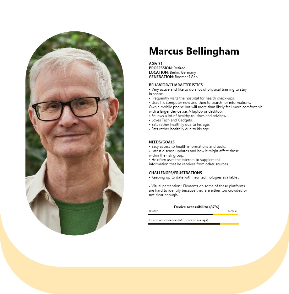
User Persona
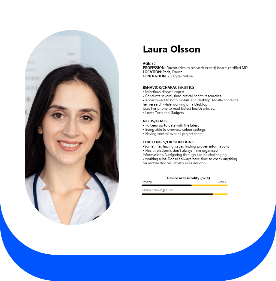
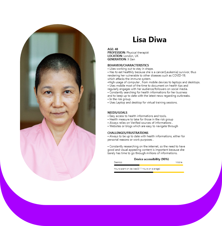
User Journey map
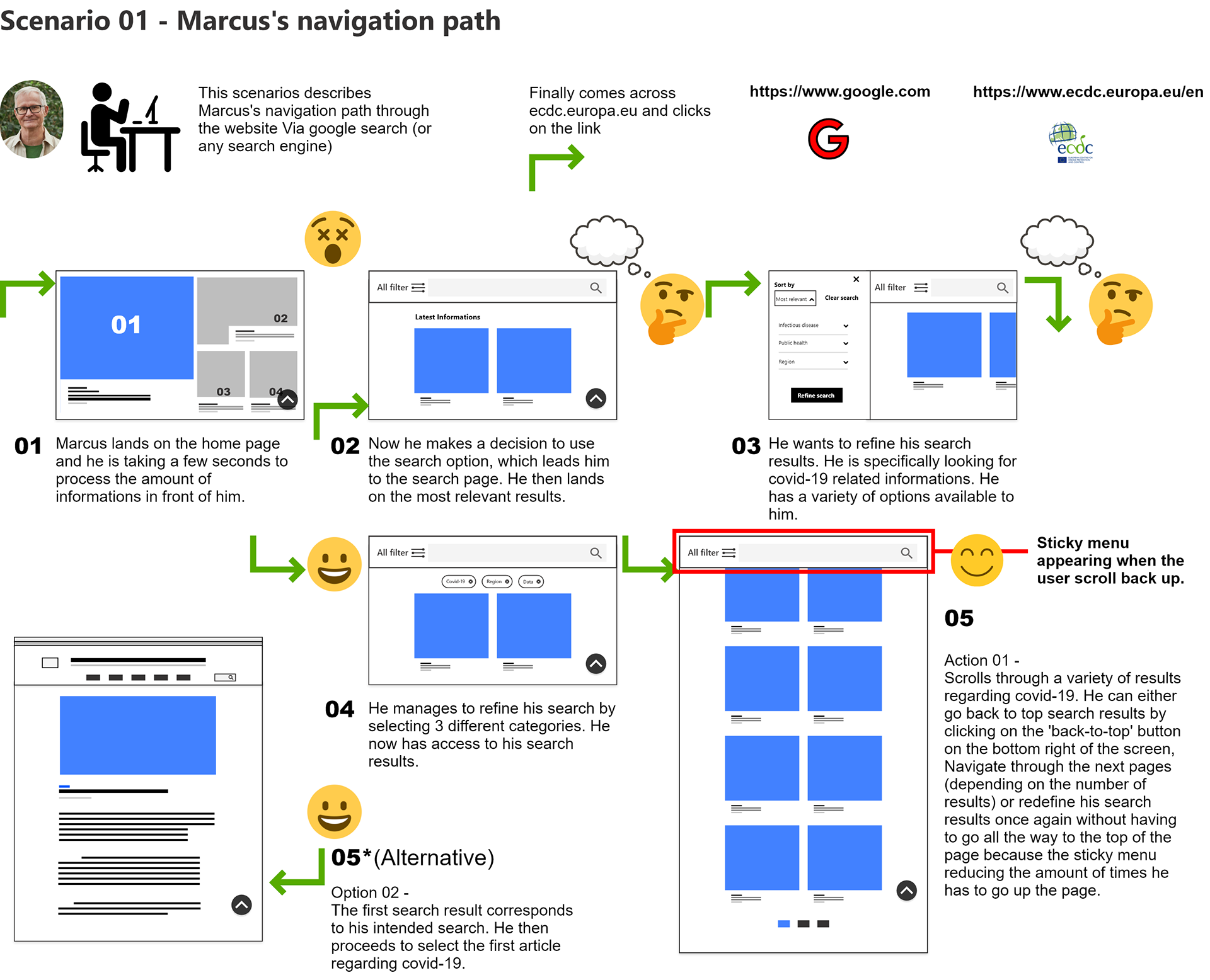
An iteration of marcus's (Persona 1) journey and the obstacles he can encounter. Countless number of iterations were illustrated during this process with the purpose of reducing the margin for errors and rendering every element easier to perceive and to interate with.

03
Prototyping
At this stage , I am putting together everything together and testing the website with my team. Everything started with sketching the different stages of navigation based on the visual Hierarchy and then proceeding to the final outcome, the high fidelity design stage.

Sketching

Because of the thorough research and visual Hierarchy , I was then able to translate everything into Low-fidelity designs and test it my the rest of the team. The test were made on Adobe XD and we tested the interaction on different mobile devices and desktop.
The Challenge
1 - Building a fluid experience from desktop to mobile.
2 - Making sure the elements were neither too small nor large
3 - Efficient colour contrast , especially for those with colour blindness.
4 - Indicator icons on menus for better guidance.
5 - I had to ensure the proximity and continuity of the navigation is well implemented during the process.
High Fidelity design
Responsiveness
Testing different devices and ensuring page content do not overlap on each other at any point. I have designed numerous breaking points of large and small device screens , from mobile to tablet and finally desktop. Why this? Because having more screen sizes reduces the number of screen errors and also make the element on the page consistent on any screen.
Filter search
Searching pages or information with the filter search now becomes easier because users have more control over their navigation. Informations are split into categories and tags are being added based on the their search selection. They can either add or remove them or click on any of them to widen their results.

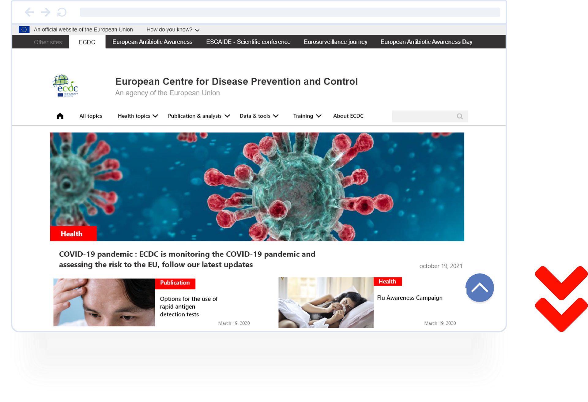
Scroll up button
Scroll up button reduces the amount of time a user has to go up and down a page.
Clean onboarding
Less trouble perceiving informations. Reduced content descriptions means that there is less time spent reading and eye scanning is faster than it was previously

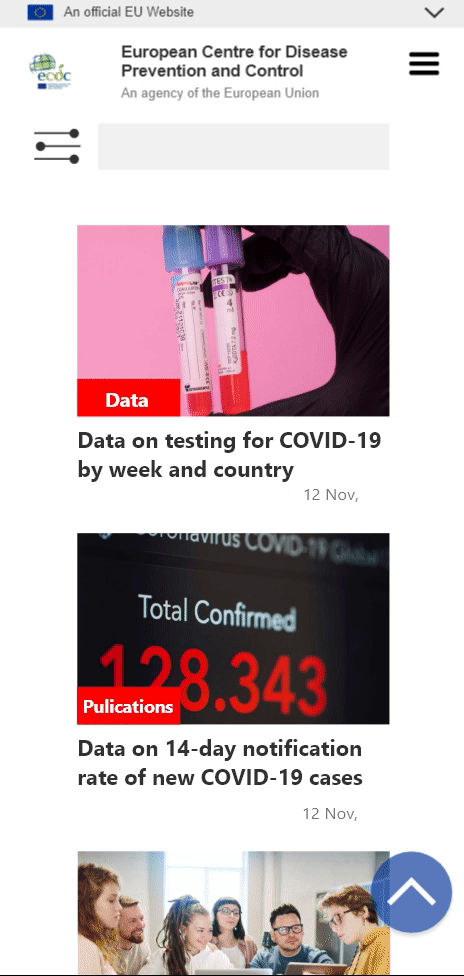
Mobile experience
Mobile experience demands a lot of attention to details because a lot has to be considered : The screen size, font and icons sizes , as well as ensuring users have similar experiences on mobile phones.
04
Testing
Analysis and conclusion with the team.
The feedback was a positive one as many of our colleagues were able to find information much easier than before. There was a decrease in the bouncing rates on our website tests and an increase in users' presence, which already was an indication that our future users have a better accessibility to content with the current design implementations.
The most common positive feedback comes from the vast improvement on the Ui and the content layout.

Desktop onboarding version 1
Desktop onboarding version 2
There were , however, a few things to consider in order for me to improve the work in place:
- Discussing the content we have and what we believe are more relevant to user at the moment.
- Conducting more and more testing after the development phase for greater analysis on how it impacts the wider audience.